Exhibition Text
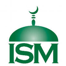
Title: Islamic Society of Milwaukee logo design
Medium: Digital Manipulation
size:7x5in
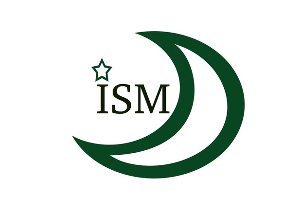
This is a logo design I made for Islamic Society of Milwaukee. I used photoshop to make the logo design. I mainly used the paint bucket tool and custom shape. My intention with this design is to makehj a simple logo that represent the Islami`c Scoiety of Milwaukee that is simple yet meaningfull. I was mostly inspired by other logo designers and their design. One of my greatest inspirations was Milton Glaser, I like the simplicity and symbolism behind his work.
Medium: Digital Manipulation
size:7x5in
This is a logo design I made for Islamic Society of Milwaukee. I used photoshop to make the logo design. I mainly used the paint bucket tool and custom shape. My intention with this design is to makehj a simple logo that represent the Islami`c Scoiety of Milwaukee that is simple yet meaningfull. I was mostly inspired by other logo designers and their design. One of my greatest inspirations was Milton Glaser, I like the simplicity and symbolism behind his work.
Process
To begin this process, I had to start with planning sketches. When I heard that my local mosque needed a logo design and they were looking, I knew right away that I needed to enter. I started off by drawing three planning sketches and choosing from one. I chose the one that I thought was the best. I was looking for a simple yet meaningful design that would perfectly fit with the islamic community of Milwaukee. I then went on photoshop to make the logo, which was a difficult process. I'm not the best with photoshop and I didn't think the design was going to turn out good. At first, I attempted to draw the logo using the pencil and the paint bucket but that wasn't succesful. I almost gave up, and then I remebered some tools I used to make the flag design from last year. I used the custom shape tool and the paint bucket. Those tools made it possible for me to make the logo and make sure that it was what I invisioned. It turned out well and I even tried the other designs that I used for planning in the begining.
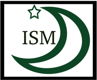
This was my initial logo. I didn;t choose this one because I didn't like the box around the logo.
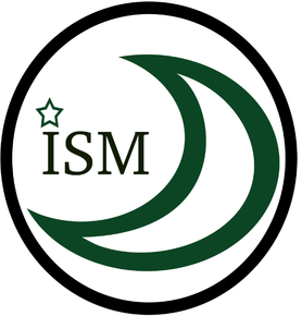
I didn't choose this one either because I didn't like the circle around the logo. it made the logo look too complicated.
|
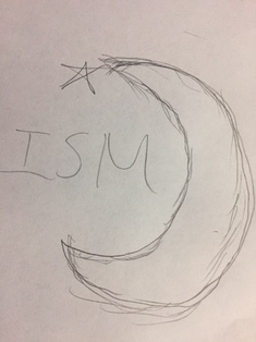
This is a planning sketch I did before I started to do the photoshop.
"Another Regional Fed Survey Collapses - ISM Milwaukee Crashes To 2009 Lows." Zero Hedge. N.p., n.d. Web. 15 Dec. 2016.
This is the current logo and I really like it but I guess mosque official want to change it because it's too old.
|
Meaning
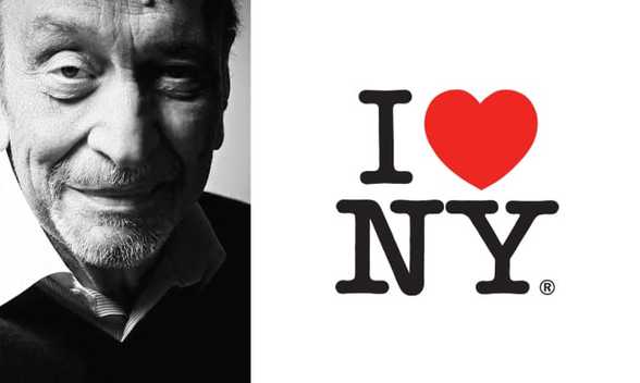
This logo design is important for my community. It means a lot for me to get involved in my community and use my knowledge to benefit them. Since we learned about designing on photoshop last year, I thought that I could use those skills I gained. My local mosque needed a new logo because the old one was outdated and too "boring" according to the sheiks. I entered myself into the competition and I'm still waiting for the result. One of the criterias of the contest was that the logo had to have a good symbolism and simple. I looked through some famouse logo designers and I liked Milton Glaser's design of the I heart new york logo design. The design was simple but the symbolism was strong. I knew that I wanted to emulate that through my logo too. The Creasant moon and star are a huge symbols in the islam community. Thus, those two elements are a part of the logo design. I didn't want to put the star in the middle because then that would be too basic and I wanted to be creative with my design. So in order not to make the logo look too basic, I made sure to place the star on top of the "i". Instaed of the dot, I thought it looked better over the I
Artist Inspiration
Milton Glaser is one of America’s most celebrated graphic designers. His designs include the I ❤ NY logo, the psychedelic Bob Dylan poster, and the Brooklyn Brewery.Thus, my artist inpiration for this work is Milton Glaser, who I thought was one of the best graphic designers out there. When I saw his art work, I really enjoyed the simplicity and creativity of his designs. After I decided to make to make a logo, I researched on some famous graphic designers. At first I liked Lindon Leader's "Fedex" logo design, which I thought was ingenious. The placement of the letters to make the arrow in the middle was nice. However, as I kept researching I found Milton Glaser, who had a lot more designs than Lindon Leader. Even though I liked Leader's design, I had a lot more options for Glaser than Leader. I looked through Glaser's famous designs, and they were all amazing. As I kept researching, I found a common theme in most of Glaser's designs. He tries to make his logos look effortless and to the point, while still being meaningful. Those were elements that I wanted in my designs. Last year we learned that flags shouldn't be too much, there shouldn't be going on in the design. I wanted my viewer's to enjoy my design and see what my design is trying tell. I feel that if my design is too complicated, viewers would get bored easily. Simpliar to Glaser's designs, my design is both simple and meaningful.
"Milton Glaser." Wikipedia. Wikimedia Foundation, n.d. Web. 15 Dec. 2016.
ACT Questions
1) Clearly explain how you are able to identify the cause-effect relationships between your inspiration and its effect upon your artwork.
Glaser's graphic design's uniqeness and significance had an effect on the way I designed my logo. I made sure to make my design simple like his designs
2) What is the overall approach (point of view) the author (from your research) has regarding the topic of your inspiration?
Glaser created his designs to symbolize the simple aspects of life. I was inspired by his ability to make small things meaningful and beautiful.
3) What kind of generalizations and conclusions have you discovered about people, ideas, cultures, etc. while you researched your inspiration?
I learned the small things such as logos are ignored but that they are important for organizations. Logos and other designs are important for reconigation of companies or other places.
4) What was the central idea or theme around your inspirational research?
The central idea of my research was simplicity and community contribuation. I wanted to contribute to my community and make a logo the symbolizes all of us.
5) What kind of inferences (conclusions reached on the basis of evidence and reasoning) did you make while reading your research?
Some inferences that I made while reading my research was that I enjoy working with photoshop. I didn't like it last year but this year I'm enjoying it.
Reflection
To conclude, I had fun with this project. It made me feel good that I was doing something that would help an organization. At first I was hesitant to do it because I lacked photoshop skills. I didn't think I was going to be able to make a creative logo that represented every muslim in Milwaukee. It was difficult but definitley doable. I learned about that graphic design isn't an easy job, I always thought it was pretty easy but that's not the case. It's the complete opposite, I also had a lot of trial and error. I designed multiple different logos that all had similar elements but it all came down to which design that was the simpliest.
